
Massage Envy is a countrywide franchise that offers massage, stretch, and skin care services. Aligned with their brand, their website has an intuitive interface that allows users to make bookings within a matter of minutes. While most of their services lived within the their main site, the career section of their site lived elsewhere.
Bringing "Relaxation"
to the Job Search.
The Challenge.
Massage Envy struggled with incentivizing a reason for potential employees to consider a career with the company. Therefore, our team was tasked with migrating their employee content on their current site and integrating it into the main website of the massage envy intellectual property.
I was tasked with leading the site migration of the employee website into the main Massage Envy site structure.


My Role.
I was tasked with the following:
-
leading initial usability testing
-
creating wireframe designs
-
prototyping high fidelity UI designs
-
leading supplemental usability testing for the final UI designs
I worked with our Lead UX Researcher, UI Designer, Account Manager, and Web Developer for this project.
Our team also collaborated with Massage Envy’s lead UX designer to align on a solid understanding of the company’s needs and goals for the site migration.
Constraints.
Our team was not responsible for the design of the original Massage Envy Brand Pages. Therefore, it was our job to find out what was not working in a design experience that our team did not create.
Process.
The process for the employee migration was as followed:

Initial Usability Testing
Primary user testing done to assess the pain points of the current website design.

Ideations
User Stories, User Flows and Wireframes were created based off of the findings from the initial usability testing.

Design
Creating final High-Fidelity designs based off of the wireframes.
Secondary Usability Testing
Follow-up usability testing done to validate our design decisions.
Initial Usability Testing
On the employee website, devices with most user traffic were mobile. Our analytics showed that 72% of users viewing the employee site were on mobile, while 26% of users were on desktop. Therefore, it was imperative that I facilitate user testing that acknowledged pain points of both mobile and desktop users. Mobile findings would hold a bit more weight in our re-design decisions.
I decided that the user testing would be moderated, so that we could fully understand and probe the thought process of users' job application journey when exploring the employee brand website.
Specifying the Goals
Our first step in the initial user testing phase was to figure out the testing goals.
The goals were as followed:
-
Ensure overall job search experience content makes sense to the user
-
Identify any friction points throughout the job application experience.
-
Acknowledge any opportunities where design or content can be prioritized for the brand migration.
Planning the Execution.


The Screening
From there, I started screening for users that were:
-
looking for a job within the past 5 years.
-
18 years or older.
-
Have a GED education or higher.
*We also made sure that we were testing 8-10 users, 4-5 users on mobile devices and 4-5 users on desktop.
Adressing the Tasks
The next phase consisted of constructing a testing plan. From there, I came up with key objectives for what features we wanted to test on the site:
Site Familiarization
Having users give initial impressions while exploring the current landing page design.


Search Bar/Future Navigation
Allow users to access the global job search bar and explore usability of the interaction.


Search Results
Have users analyze the search results page.


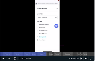
Filtering Search Results
Enable users to explore interactive elements of the search results page and filter to more specific job criteria.


Job Description Details
Let users evaluate content and structure of a job posting to determine most (& least) valuable information in the hierarchy.


"Save Jobs" Interaction
Ensure there is clarity and understanding of the
"Save Job" Interaction on the Job Details page.

General Site Feedback
Asking participants for final thoughts on the overall navigation of the employee-job search experience.


The Massage Envy team, stated that they wanted to prioritize both the search bar feature and navigation. We kept this in mind, while understanding the core goal for this migration process: to allow for an easier job application experience while reducing any friction.
The Findings
I used Userzoomgo to proctor the testing and developed some solid, yet impactful findings:
Search Bar
The functionality of the “Keyword” field in the search bar was confusing to many participants.
The label “keyword” for the search box text entry seemed confusing. Users didn’t know what was being asked from them or what they should enter.
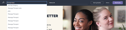

“Keyword” recommended results displayed in the drop-down were confusing and overwhelming.
Users were shown a list of many identical recommended results in the keyword auto-complete dropdown. This confused users as to which “Massage Therapist” result they should select.
Considered Recommendation:
-
Rethink the label OR functionality of the keyword field so it is easily understandable.
-
Clarify & simplify auto-complete results, ensuring vague hierarchy and repeated results do not confuse users.
Search and Filter Results


On mobile devices, the responsive design puts less essential content above the more important search results.
Three employee reviews are at the top of the search results page, requiring users to scroll. This content is less essential to the users’ needs than the actual job list.


Mobile users had trouble finalizing their selections after entering information in the filter feature.
Some users expected the “clear all” button to enter their selection, as it is designed as the primary interaction.
The “x” button at the top-right also confused users, as they expected it to cancel their filter - in reality, this simply closes the modal with filters applied.
Users found complexity behind the differentiation of set expectations for region-wide postings, as opposed to specific job posts.
Considered Recommendation:
-
Clearly differentiate and set expectations for region-wide postings, as opposed to specific job posts.
-
On Mobile, ensure filter interactions to save, close, and reset are designed to be clear and align with user expectations.
-
Search results should be immediately visible; employee reviews could either be removed entirely from search results page or placed at the very bottom of the search results content.
Job Details Page


Parts of the Job Detail page may be unnecessary, crowded, and have repetitive information.
When facilitating our testing, users found the glassdoor card link, the massage envy benefits, and the video at the bottom to be the least valuable content.

The large image in the header took up too much space on the Job Detail Page.
Users had mentioned that the the picture takes up a ton of valuable space, but adds little value to the page itself.
Information in content card brought little value and the Glassdoor link does not work as expected on the Job Description Page
Users felt that this area had similar information to copy elsewhere on the page.
Some users noted that they would likely do secondary research outside of the Massage Envy site anyway, so the glassdoor link (with a somewhat poor rating) may not be necessary.
Considered Recommendation:
-
Remove or use a smaller image, so as not to compete with information with content users are actually looking for
-
Omit or scale back least valuable features on the job detail page and restructure to provide more clarity.
-
Underscore interaction feedback by using more significant color change & multiple modalities (shape, messaging, etc)
-
Ensure that access to a user’s ‘Saved Jobs’ is easily apparent.
Save Jobs Interaction

The ‘Save job’ interaction does not provide adequate feedback, relying only on a slight color change.
Users thought that the save feature didn’t activate when clicking on the “heart” icon.
Since this status is only reflected by a slight color change, they were unsure whether anything happened.


Additional clarity around where users could find their saved jobs is needed.
From the job detail page, some users were unsure how they would be able to access their saved jobs; they didn’t notice the header link, and were unclear that the ‘Saved jobs’ tab toward the bottom was interactive.
Considered Recommendation:
-
Underscore interaction feedback by using more significant color change & multiple modalities (shape, messaging, etc)
-
Ensure that access to a user’s ‘Saved Jobs’ is easily apparent.
User Stories
After I presented the findings to the client, I started brainstorming user stories for the employee migration experience:
Search Bar

-
As a massage therapist applicant, I want to utilize a job search bar feature with an easily navigable experience, particularly on mobile devices.
Filter Jobs


-
As a massage therapist applicant on the search results page, I want to ensure filter interactions to save, close, and reset are designed to be clear and align with user expectations.
Search Results

-
As a massage therapist applicant on the search results page, I want to see clearly differentiated expectations for region wide postings as opposed to specific job posts.
-
As a massage therapist looking for a role on the search results page, I want to immediately view search results on my mobile screens.
Job Detail

-
As a massage therapist applicant, I would want the most valuable content prioritized on the job detail page.
Save Jobs


-
As a massage therapist applicant, I would want the save jobs interaction to have prominent feedback.
-
As a massage therapist applicant, I would want to access my saved jobs easily during the job search experience.
Ideations
User Flows
After creating user stories, I made user flows to flesh out the frame work of our wireframes. I focused on user flows for the search bar and search results experience.


The Wireframes
After planning out the major elements of the user flow, I was able to fully flesh out some wireframes for the employee brand page redesign:


Designs
From here, our UI designer worked alongside our team to bring our wireframes into high fidelity mockups. We then presented these mockups to the Massage Envy team for approval


Next Steps
After we presented our UI designs to Massage Envy, our team had followed up the designs with a second round of usability testing on the re-designed pages. We did this for the following reasons:
-
We wanted to validate the design decisions that were made.
-
We also wanted to acknowledge any other pain points that needed to be addressed in the final edits of the design.
Secondary Usabiltiy Testing.
THE SCREENING
Screening format for users was similar to the initial user test that we had completed.
We decided on testing 4 mobile users and 4 desktop users. Due to tight deadlines, we decided to test user in an unmoderated testing format. Users would engage with a prototype where they would be able to navigate through the pages easily, similar to a live website.
I also held responsibility for prototyping the pages for unmoderated usability testing. I prototyped pages that were adaptable for both mobile and desktop screens.
The Findings
For the redesigned employee brand pages, findings from the second set of user testing were mostly positive. Many users appreciated how clean and easily navigable the re-designed pages were. Callouts from the site included:
Search Bar

On mobile, the “Find Jobs” interaction was too low on the user’s mobile device.
Users did not know how to finalize their search until they scrolled toward the bottom to the “Find Jobs” interaction. All users acknowledged that the “Find Jobs” interaction was too low on the mobile screen.
Considered Recommendation:
-
Ensure in development that the “Find Jobs” interaction always appears at the bottom of the screen, regardless of device size.
Job Details Page

Most users agreed that the least valuable content on the job listing page was the video.
Users expressed that the video was not important to their job search and therefore could be omitted. Users disinterest toward the video further validates how user reacted to the current state testing.


Some users recommended that certain additional details be incorporated into the job listing page for clarity.
1 user felt that adding a few reviews to the company would help with job details, while another user suggested adding more details such as images of the location and their phone number.
A user also expressed that adding required years of experience in the description could help users understand whether they are qualified.
Considered Recommendation:
-
Consider adding more context and introduction text to explain what the video will cover, or adjusting placement of the video.
-
In a future update consider adding fields that users might value when learning about the job description.
Save Job

Adding more clarity to the “save job” interaction ensure users understand feedback given to them.
During testing, 1 user acknowledged that the save job interaction was still a bit too vague, and confusing. Language in “saved job” interaction’s active state is very similar to the inactive state, causing some confusion.
Considered Recommendation:
-
Consider further emphasizing visual feedback potentially with different language and subtle visuals
In Conclusion,
Working with the Massage Envy team proved to be an exciting yet challenging experience. Our challenges were not just limited to a simple migration of selected pages onto the main website. Our team had to redesign certain experiences of the employee brand pages to ensure its aesthetic was cohesive with the overall branding of Massage Envy.
Being tasked with usability testing helped in guidance for what design decisions would be best for the Employee Brand Migration. The testing I had facilitated helped to address the major issues the live site had by,
-
Reducing friction while creating an engaging interactive experience
-
Prioritizing which design experiences should be transferred into the brand migration
More Projects.
Check out other Projects that I've worked on!

User Testing a Navigation Experience Redesign for a Financial Website
User Testing Newly Designed Web Pages for a Financial Website